CSS Grid Layout is a big beautiful beast that I cannot cover adequately in one post, so my aim here is to cover the basics and teach you how to create some simple layouts using modern CSS. I'll be posting detailed CSS Grid tutorials in the coming weeks.
Basic CSS Grid Layout
Let’s start by creating a simple three column layout.
Inspect the HTML, and you’ll notice how clean it is — there are no wrapper elements for rows or columns, there’s just a .grid parent; this is because each direct child element of a Grid becomes a Grid Item by default. It works in the same way as CSS Flexbox — when you set a parent item to display: flex all children become Flex Items.
The CSS is also very clean. We only need three properties applied to the parent .grid to create this layout! You likely have a few questions, so let’s go through what we’re doing:
- Create a grid by setting the
display: gridon the.gridelement - Set the grid “gutters” by using the
grid-gapproperty - Create columns by using the
grid-template-columnsproperty — specify the columns with space separated values (this can be a pixel, percentage, em, or any other valid CSS unit) - We are using the new
fr(fraction) unit. It's similar to a percentage value but smarter, let me explain more.
CSS Fractions
With CSS Grid we get a new unit called fr; a fractional unit that specifies the amount of available space to use; 1fr is for one part of the available space, 2fr is for two parts, and so on.
It’s better than using percentages because it takes in to account things like grid-gap and calculates widths on the fly, there's no need to worry about margins, paddings, or anything else, fr will ensure space is divided up correctly. Read this CSS Tricks article covering the fraction unit for more details.
Creating Rows and Columns
When you want to create Rows, you can use the grid-template-rows property on the .grid parent. This works exactly the same way as grid-template-columns. Below is a 3x3 grid using CSS Grid.
Two Column Layout
So now you have a basic understanding of how we can create rows and columns, let's move on to a more typical website layout.
Above we have a header, sidebar, content, and footer areas. However, this time we have introduced a couple of new things:
- Using the
repeatfunction to create repeating columns — the syntax above is the equivalent of writing out1fr 1fr 1fr. - Set a pixel height to the first and last row.
- Using
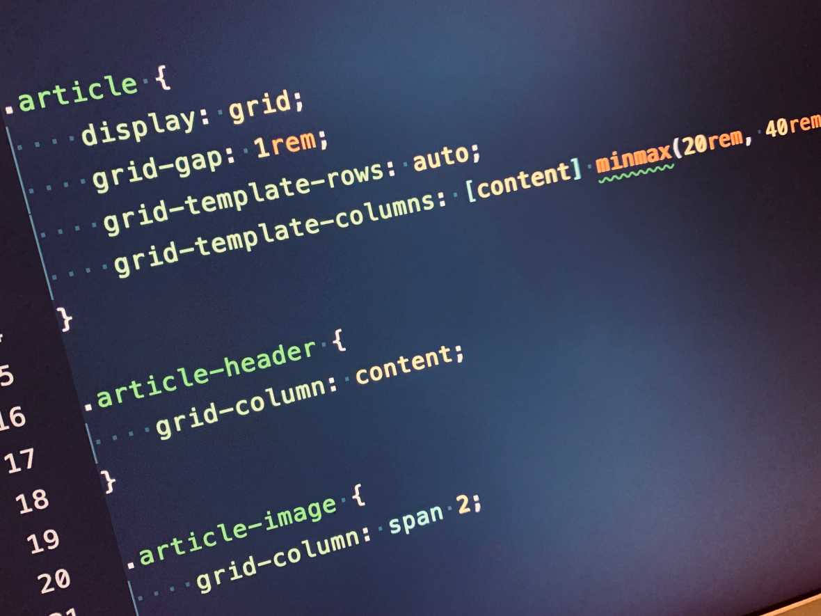
grid-columnto specify the number of columns items should span.
So, with grid-template-rows we are mixing pixel and fraction units meaning the first and last rows are fixed sizes, while the second row is 1fr — meaning it’s flexible and will grow and shrink accordingly based upon the content placed inside.
The grid-column property is used to make the header and footer span all three columns, and to make the content area span two columns. The sidebar does not have this property set as the default is to span one column.
All of this gives us the above layout, and I’d say it’s a pretty clean way to do so, but I prefer to use named grid areas using grid-template-areas. Let me explain more…
Named Areas
When using the grid-template-areas property, you can describe your grid layout visually using ASCII art. Once you have described the grid, you can place content in each area using the grid-area property. Inspect the CSS below to see an example of this.
At the moment this is my preferred method because you can quickly change your layout, moving content around and adjusting sizes, by updating only the grid-template-areas property.
If you wanted to move the sidebar to the right of the content, you would use the following code:
.grid {
  ...
  grid-template-area:
    "header  header  header"
    "content content sidebar"
    "footer  footer  footer";
}
Or you could make the header only two columns wide using the following code:
.grid {
  ...
  grid-template-area:
    "header  header   ."
    "content content sidebar"
    "footer  footer  footer";
}
The . indicates an empty grid cell, ensuring your content begins in the second row.
Grid frameworks
When I first started using CSS Grids, I immediately thought to look for a grid framework to use. I fairly quickly realised that it's not needed — CSS Grid is the framework! I just needed to break old habits and learn this new tool correctly.
You don't need .row’s or .col’s in your HTML, you use CSS to describe the grid and merely place content on the grid. It doesn't make much sense to create additional markup for rows or columns as we have done previously, the entire grid layout should be designed and controlled with CSS.
Roundup and Resources
CSS Gris is a genuinely fantastic layout tool, and I’m very excited about the new possibilities it gives us. I’ve only scratched the surface of what’s possible in this article, but I’ll be covering some more advanced use cases and features soon.
If you want to learn more about CSS Grid, try reading and watching the following resources: